Palmetto Dunes Resort Website Relaunch
2020 W3 Silver Award in Tourism Websites
w3 Awards | Morrison

The Palmetto Dunes Oceanfront Resort website was suffering from disorganized content, complex navigation, and a difficult booking process. Our team collaborated closely with Palmetto Dunes to rebuild the entire site. By aligning their marketing goals with user needs, we re-established KPIs and restructured the site's architecture from the ground up. The result was a flexible, templated site with a more engaging brand voice, a streamlined booking system, and content organized for optimal user flow. The site regained its competitive edge, significantly boosted lead capture & engagement, and provided a solution that continues to deliver value to this day.
Client
Palmetto Dunes Oceanfront Resort in Hilton Head
Year
2019-2020
Highlights
Information architecture restructuring
Refreshed brand design
Improved user experience
Understand & Explore
Discovery
We kicked off with an intensive, two-day discovery session at the resort. Working collaboratively, we defined goals, the audience & stakeholders, clarified the brand, and sketched out initial homepage concepts.
Information Re-archtectured
Using our new insights with consistent client check-ins, we overhauled the site's architecture. Navigation and content were also reprioritized to meet the audience’s and the resort’s goals.
Laying out the blueprints
Before diving into the brand refresh, we took the information organization further to understand what existing content could be reused, what needed to be created, and how it should be structured

Brand & Design
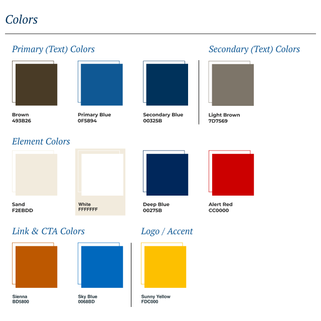
A hue adjustments
To create a more modern and appealing visual identity, we built upon the existing blue and yellow brand colors. We replaced the old, highly disliked green with a fresh, beach-inspired palette, allowing the site's rich imagery to have a greater impact.
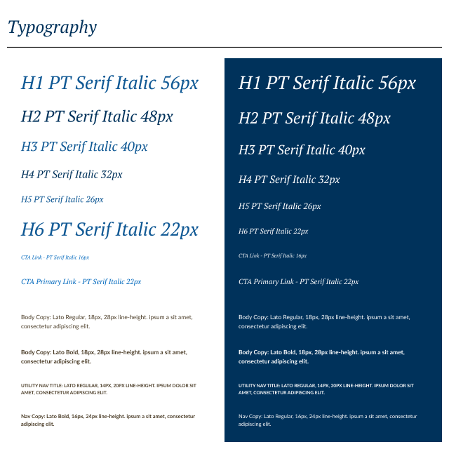
Laid back legibility
To create an expressive and effective typographic system, we researched type pairings. To add personality, we selected a breezy serif font for large headlines and calls to action. A highly legible sans-serif font for body text ensures accessibility.
Letting the content breathe
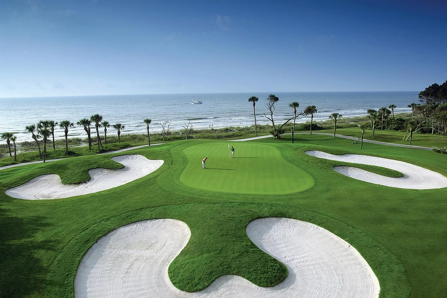
To make the content more engaging and digestible, we designed layouts with a "less is more" approach. The result is a clean design that pairs striking imagery with just enough copy to pique user interest without overwhelming them.
The Palmetto Dunes site is live.
Six years later, and the site still (mostly) looks the way we rebuilt it.